© Ginake.ro · Privacy Policy · Terms & Conditions
Ghiseul.ro – Brand Toolkit
This project was part of a competitive contest aimed at reimagining the visual identity of Ghiseul.ro, a pivotal government platform facilitating online payments for Romanian citizens.
Brand Toolkit
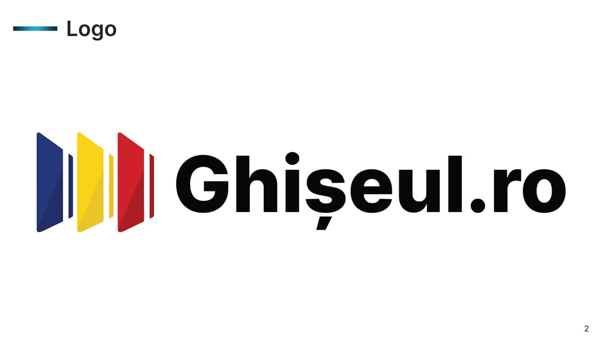
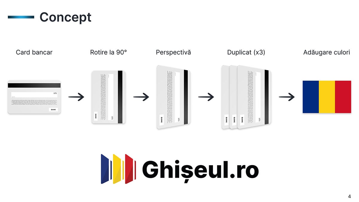
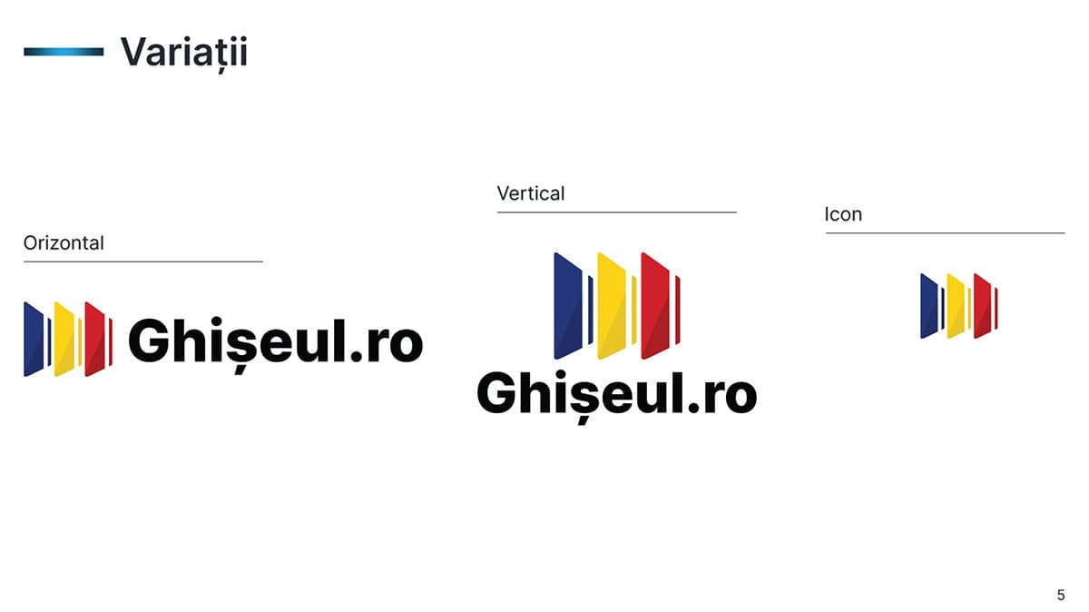
The new logo encapsulates the essence of Ghiseul.ro through a symbolic representation of three vertically stacked cards, each adorned in the patriotic hues of the Romanian flag — red, yellow, and blue. This iconography is not only a nod to the national identity but also a clever metaphor for the transactional layers facilitated by the platform. Accompanying the icon is the platform's name, "Ghiseul.ro," typeset in the sleek and modern Inter font against a stark black backdrop, ensuring legibility and professional poise.
The comprehensive Brand Toolkit developed for Ghiseul.ro serves as a guardian of the brand's integrity. It meticulously outlines:
• The conceptual underpinnings of the logo design.
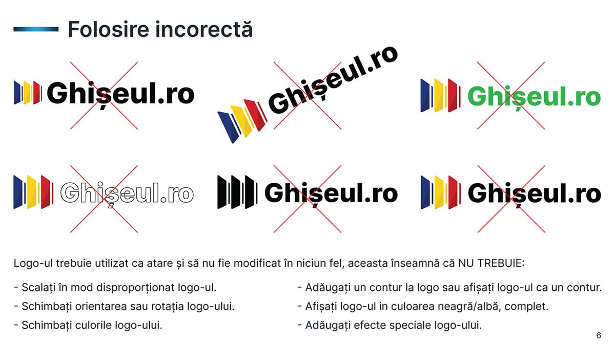
• Guidelines for the correct and incorrect usage of the logo, ensuring consistency across various mediums.
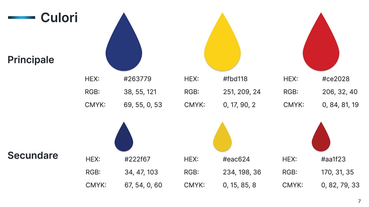
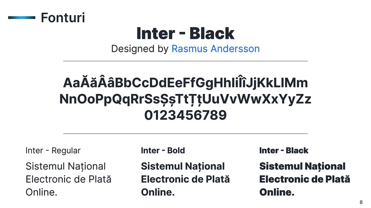
• A curated palette of fonts and colors, chosen for their visual harmony and psychological resonance with the brand's values.
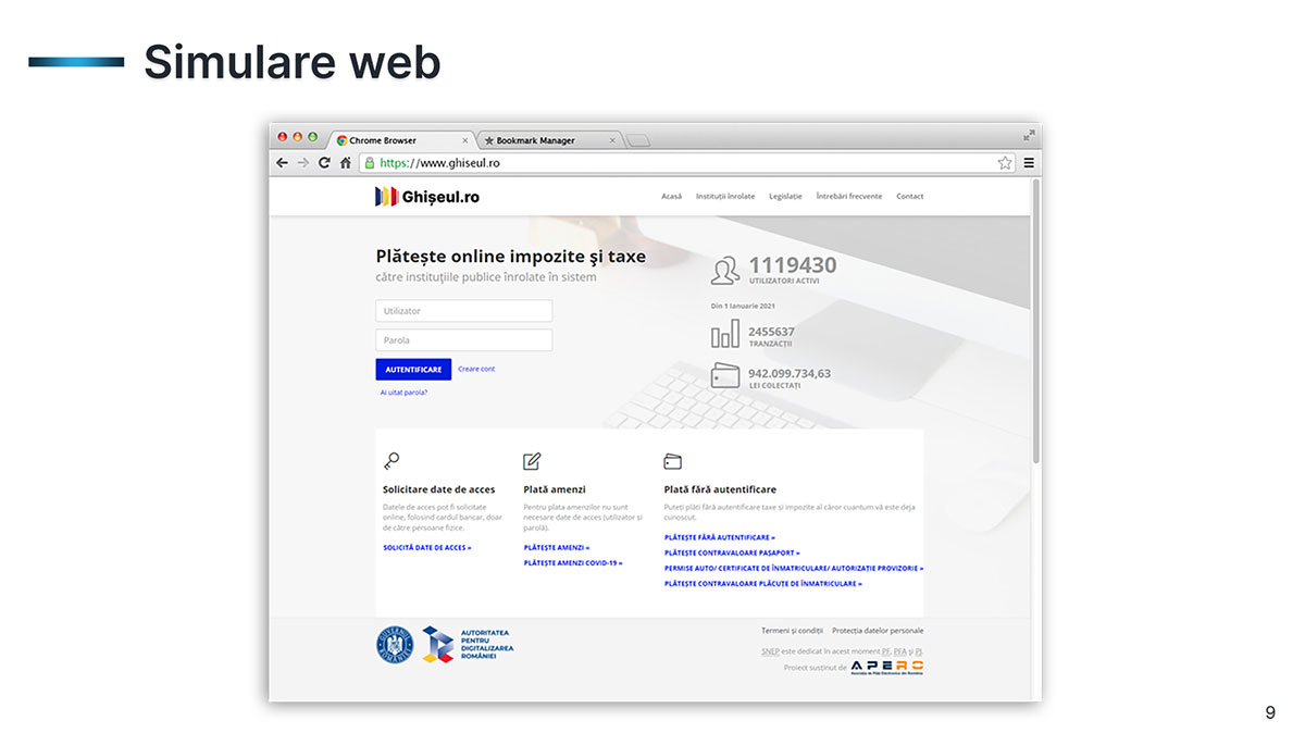
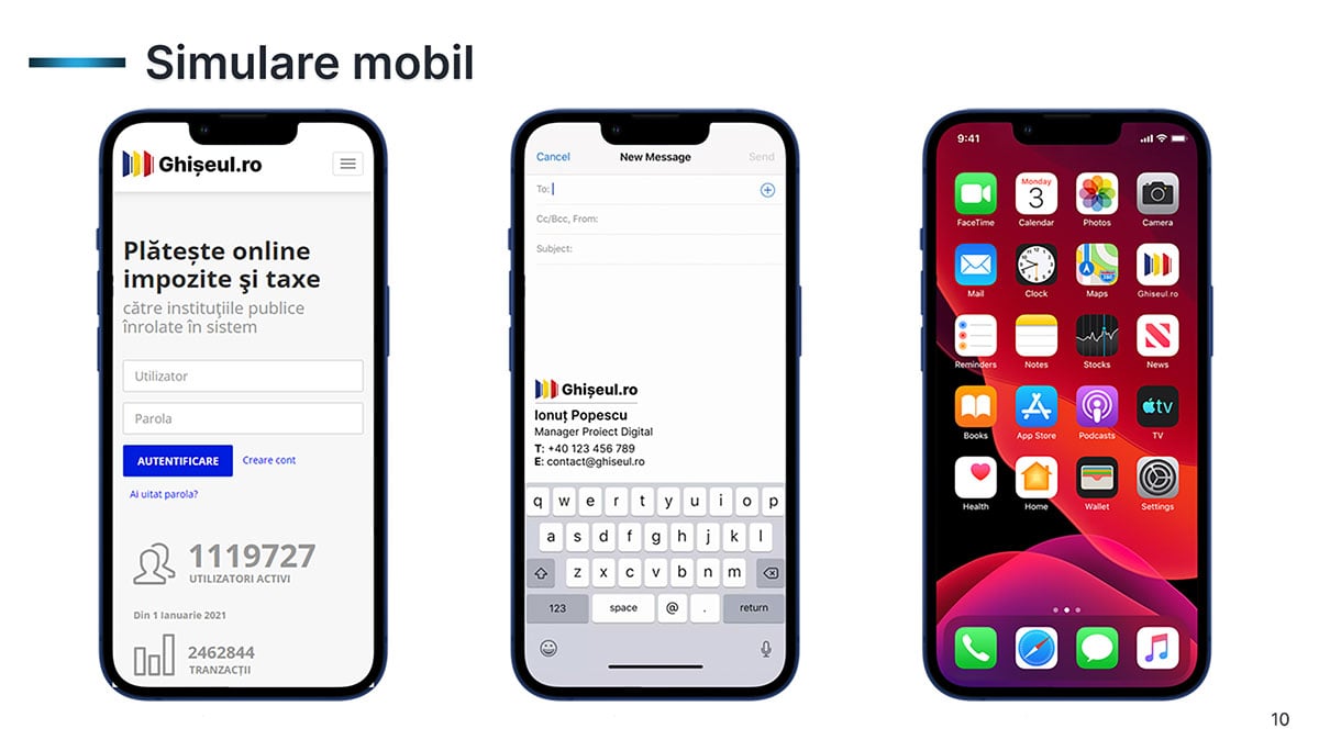
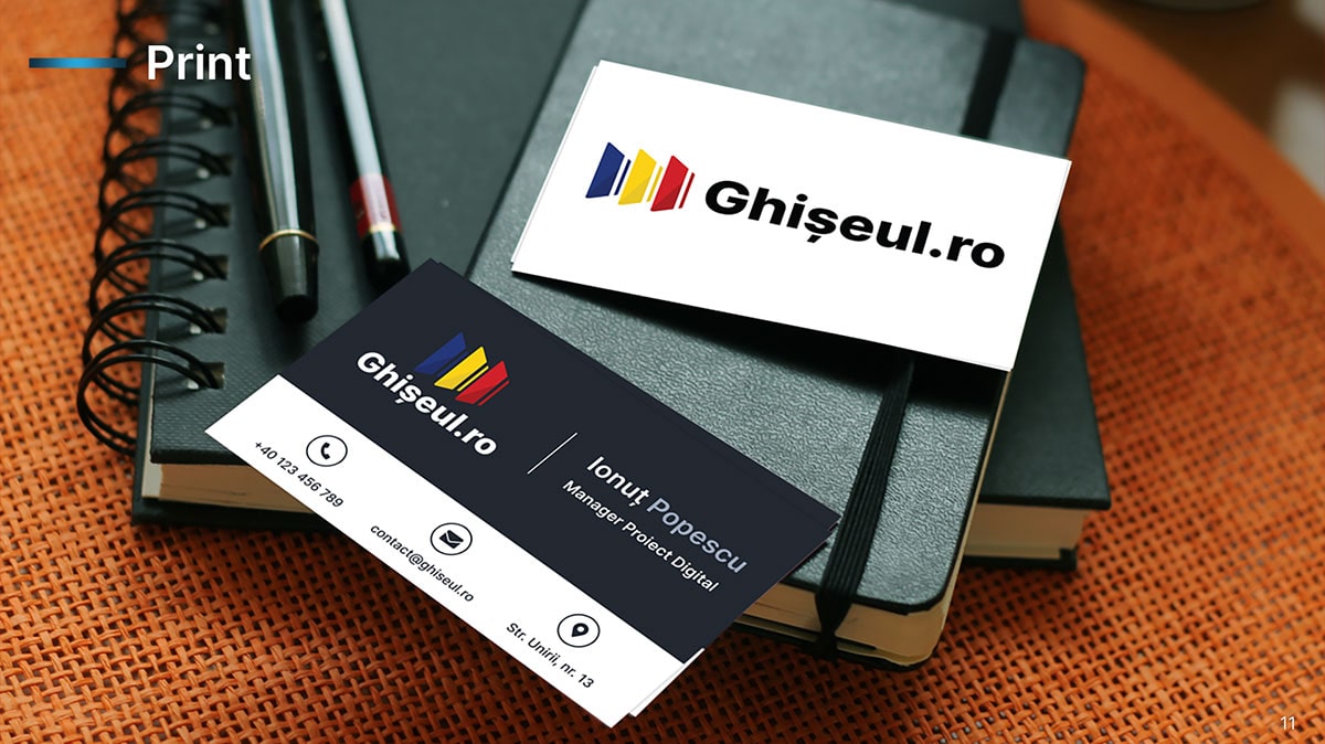
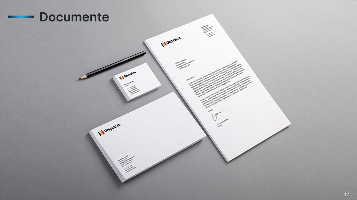
• Detailed specifications for the application of the logo in digital and print formats, guaranteeing uniformity in public perception.
Ghiseul.ro
Brand Toolkit
